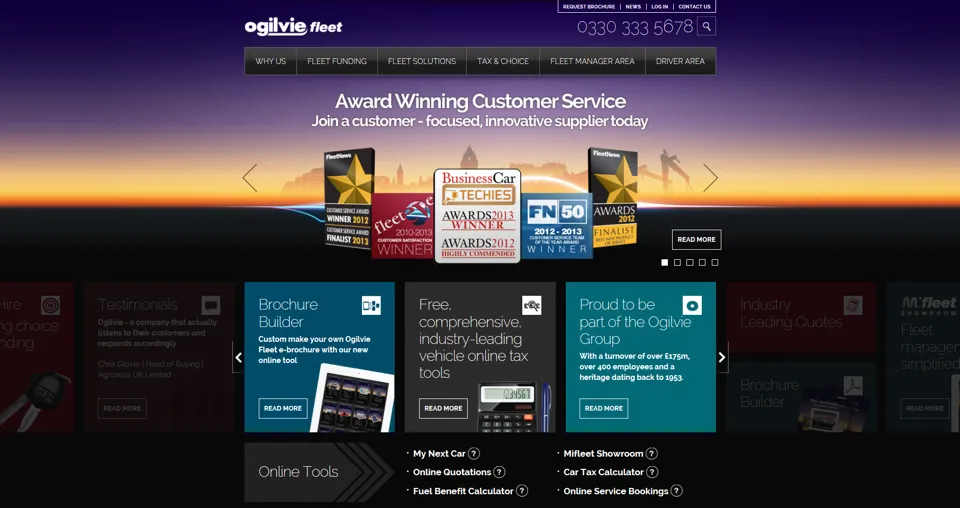
Ogilvie Fleet has launched a new 'responsive' mobile-friendly website.
Ogilvie Fleet says it is one of the first in the contract hire and leasing sector to utilise fully responsive web design.
This means irrespective of whether users are accessing the site via a desktop or laptop computer or through mobile devices such as smartphones and tablets, the screen size automatically shrinks images and copy scales to fit the browser window. Consequently, website content is always displayed in its most readable form irrespective of device used.
Ogilvie Fleet sales and marketing director Nick Hardy said: “Our new website features further design improvements, significantly increased content and is faster and easier for users to access. However, the most important fact is that it is fully responsive.”
Hardy explained: “We believe that fully responsive web design is a must have for websites and we think that Ogilvie Fleet is among the first, if not the first, contract hire and leasing company to utilise the technology and is also among early UK fleet industry adopters once again putting the company at the forefront of the marketplace.”
| Did you know fleetnews.co.uk is mobile-friendly for the latest fleet news? Why not keep up to date on the move by checking in on your mobile or tablet. |


Login to comment
Comments
No comments have been made yet.